タイトル通りにplotしようとしたら詰まったためメモ。
サンプルデータ。\(x1 \sim Binom(20, 0.2)\), \(x2 \sim Binom(20, 0.5)\)
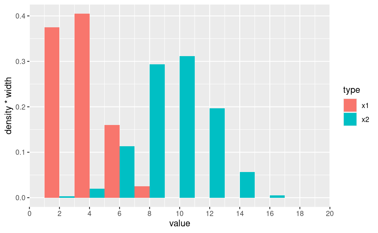
Githubにissueが上がっていたが、そのままだとgroup毎の頻度がずれていた。結論としては、geom_histogramにbinwidthではなくbreaksを渡さないといけなかった。
breaksなし
bw <- 2; min_val <- 0; max_val <- 20
ggplot(df, aes(x = value, y = stat(density*width), fill=type)) +
  geom_histogram(binwidth = bw, position=position_dodge()) +
  scale_x_continuous(breaks = seq(min_val, max_val, bw), limits = c(min_val, max_val), expand = c(0, 0))
breaksあり
ggplot(df, aes(x = value, y = stat(density*width), fill=type)) +
  geom_histogram(breaks = seq(min_val, max_val, bw), position=position_dodge()) +
  scale_x_continuous(breaks = seq(min_val, max_val, bw), limits = c(min_val, max_val), expand = c(0, 0))
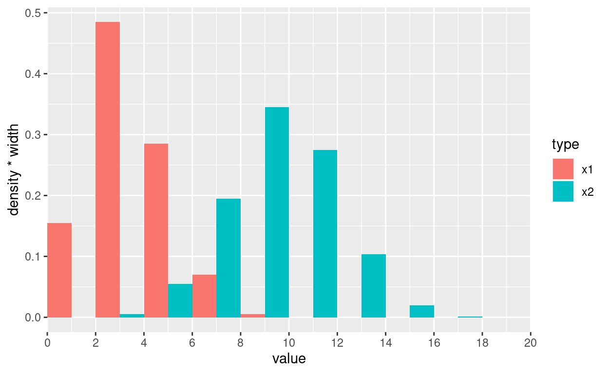
頻度表
df %>%
group_by(type, ints = cut_width(value, width = 2, boundary = 0)) %>%
  summarise(n = n()) %>%
  mutate(freq = n / sum(n)) %>%
  select(-n) %>%
  pivot_wider(names_from = type, values_from = freq, values_fill = 0)
# A tibble: 9 × 3
  ints       x1      x2
  <fct>   <dbl>   <dbl>
1 [0,2]   0.155 0
2 (2,4]   0.485 0.005
3 (4,6]   0.285 0.055
4 (6,8]   0.07  0.195
5 (8,10]  0.005 0.345
6 (10,12] 0     0.275
7 (12,14] 0     0.103
8 (14,16] 0     0.02
9 (16,18] 0     0.00167